Apple Pro Raw DNG files are underexposed
Hello,
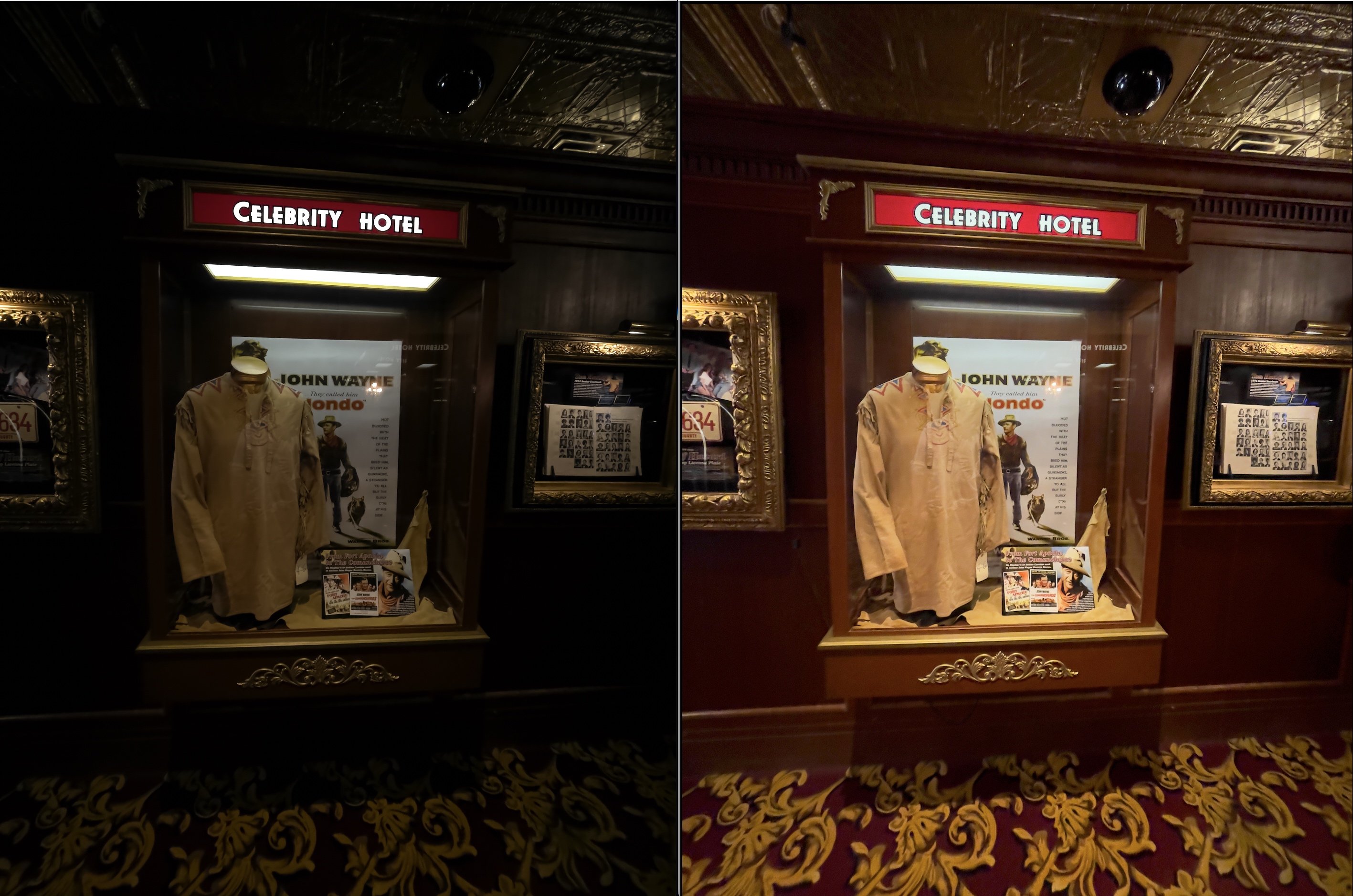
I'm using V.22 and the Pro Raw DNG photos taken on my Iphone 12 Pro Max appear very underexposed in C1. As you can see in the image, the photo on the left is how C1 processes the image, and the image on the right is how it shows up in Preview.
The files were imported as part of an Aperture library.
The DNG files base characteristics are:

I have tried all the curves, and while they are better than "DNG Standard" they still look quite poor when compared to opening the file in preview.
Is there a setting I'm missing or quick way to fix this without manually adjusting all of the images?
-

Well, if the ProRAW files from your iPhone 12 are like those from my iPhone 13 Pro, then keep in mind that they're not really "DNG" files in the sense than a normal camera is. It surprised me a lot when I noticed that ProRAW DNG files are quite a bit larger than iPhone 13 Pro Raw (DNG) files. Turns out that Apple includes a lot of Apple-specific tuning data in ProRAW and I'm not sure what of that C1 uses.
My ProRAW files never look very good as-rendered by Capture One. I invariably need to adjust them to get them to look good. If you're seeing consistent differences, like a constant exposure correction being needed, you could always create a Style or Preset and apply it during import.
The reason they look good in Preview could well be because Preview's an Apple product and Apple may have built the capability in to properly render ProRAW files, like they do in Photos.
0 -
Is that why there isn't an ICC profile for the Iphone?
I tried auto adjust in HDR settings and played around with ICC profiles from other cameras. Selecting auto adjust in HDR brings the photos much closer to how they look in Preview.
Changing the ICC profile and the curve also improves the DNG, although the different profiles are a bit more of a creative choice - But using these two tools together gets a pretty good image from the raw.
Interestingly, the preview version seems slightly stretched, maybe by 1%. It's difficult to notice unless you are looking at the photos side by side and which version is correct. Also, in Preview, the colors in the shadows are a good deal more vibrant.
0
La publicación no admite más comentarios.
Comentarios
2 comentarios