Bug Browser Layout - Stars overlapping pictures

Hi,
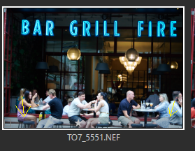
There seems to be a bug in the latest version of C1 (16.2.2) - or at least I did not notice it in previous versions: The star rating and colour tagging suddenly is overlapping the picture, instead of underneath. As you can see below, depending on the picture, it makes it either very hard to read or completely invisible. I checked the overview pages for the browser - it has always been underneath, and it should be - in particular as there is a lot of vertical space anyway. (In case someone thought this was a new feature and not a bug - no thanks. I neither need picture details hidden, nor invisible ratings.)
As I (and probably most users of C1) critically depend on the rating, could you please fix this as soon as possible?

Thanks
Thomas
-
The start have always been within the thumbnail, but in a band which was darker. In your thumbnail, the band seems lighter than it is with version 22. (see yellow arrows)
And you're right, the star is hardly visible now. It seems they lightend the band.
But maybe they made it dependent (in v23) on the setting of the Crop's opacity in preferences, can you check?
Anyway, they should revert this, imo.
 1
1 -
I think I figured it out - if you go to View - Brower Settings, you can switch from "Status" to "Edit" mode, and then the stars are underneath the thumbnails. It looks like someone has for whatever reason changed the default. Not a very good idea.
0 -
You're right, in Edit mode it is indeed below the thumbnail. I didn't notice it as I'm always in Status mode.
If your screenshot actually shows what you see (in Status mode) on your monitor then there is still an issue with the opacity of this band, as the band is brighter than with my Windows v22 version and makes the stars harder to recognize.
0

投稿コメントは受け付けていません。
コメント
3件のコメント