Colour Grading

I'm not used to using colour grading and would love to get the same look as the Wes Anderson's film Asteroid City; I'm not sure if the clours are just muted or there's a lot more to it.
Do you have any advice to get the look I'm after?
-
I don't, but maybe you find something here:
https://www.youtube.com/watch?v=EEyoONoIYgk
0 -
Richard Allen btw. you can upload any image here
https://color.adobe.com/create/image
and create a color palette from the image in order to use it as a reference or maybe to create a preset or style in C1, e.g.

EDIT: An even better video:
https://www.youtube.com/watch?v=08C__HWtOAQ
In C1, with only the Curves, and for his step 5 the Advanced Color Editor (or skin tone editor), could probably do the color grading, I guess.
0 -
Thank you so much everyone; your help was very much appreciated.
At last i can now tweak the setting to the look I'm after.
0 -
Let me speak in the name of all respondents: You are very welcome :-)
Consider showcasing one of your color graded images here, when finished, I am curious :-)
0 -
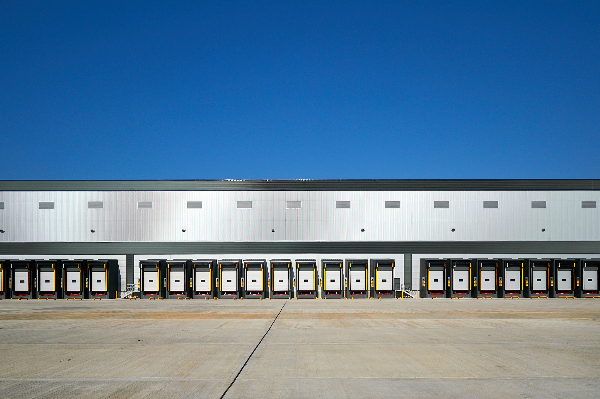
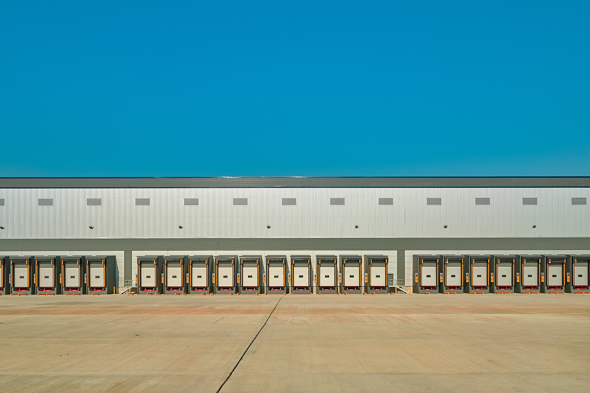
I've found that the function of converting images to a Wes Anderson look isn't as easy as I thought it would be due to my lack of knowledge of colour editing.
I've managed to get one image to what I think looks good but am finding it awkward making it into a style as most images require a different treatment, but al least it's starting point.
Here's two images, the first being the original and the second my attempt at achieeving the Wes Anderson look.
 0
0 -
It looks nice, the Rich Allen look. Having one's own look should be the ultimate goal..?!
Don't worry, by trying this you'll get more experience, this also is a goal, right?
I tried it too, I forgot what is in the videos I linked so maybe disregarding what they did.
The key for a consistent look over different images is that you work in two stages That's how the movie color graders do it (I once read a book about it).
(1) get a neutral starting point for all images, make them similar, neutral base images
(2) apply your color grading maybe using a style or presets.
That is because most tools work relative (on top of) the base image (an exception is the white balance which is absolute)How to do it in C1?
(1) Edit the background layer to get a neutral base, incl. WB
(2) Create a filled layer for your color gradingIf you are trying to find the right tool settings to mimic a specific Wes A. image, use an image of yours where the sun comes from roughly the same angle, color of sky and shadows or sunlit areas depend on it.
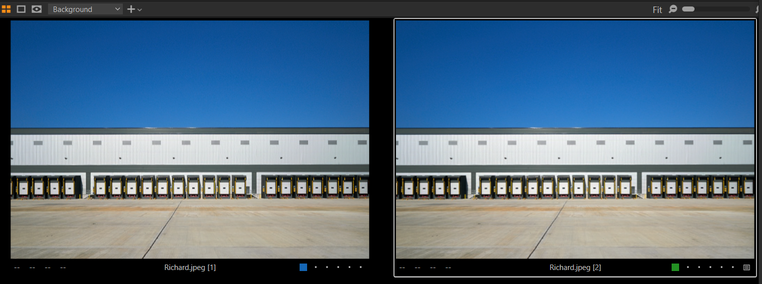
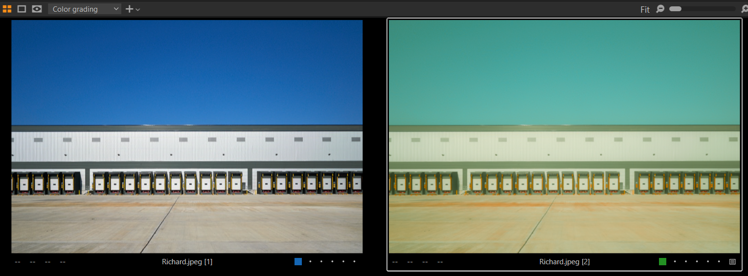
Even Wes does not have consistent sky colors, don't be too hard to yourself...I did not test it on multiple images, I used your base image (blue label) as my base and made a variant, using two Wes images as the benchmark.
My variant (green label):
Background layer: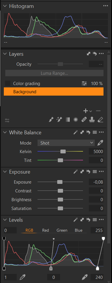
Only small brightness adjustments using auto exposure and auto levels. WB is off because I used your jpg.
That is my neutral base image, almost identical to yours:
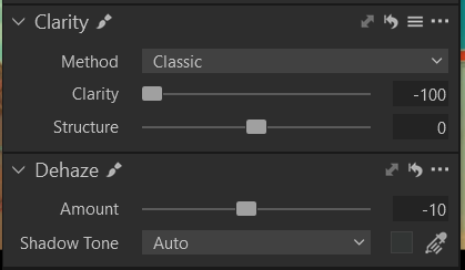
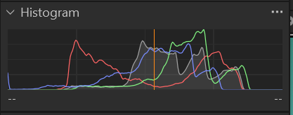
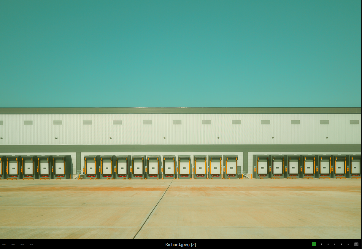
Color grade layer:Levels to reduce contrast.
Luma Curve to brighten.
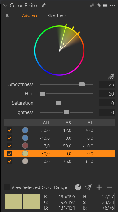
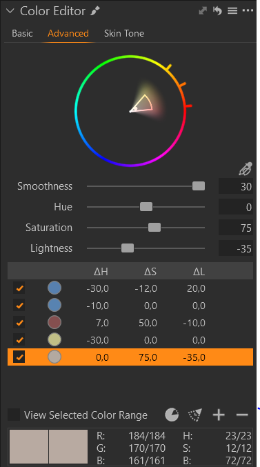
Next I are the neutral hues (white, grey), I push them to a slight greenish-yellowish tint.
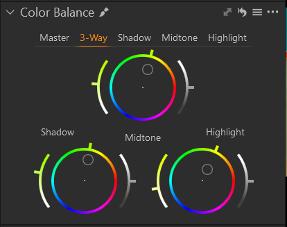
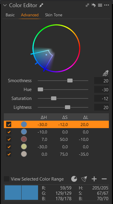
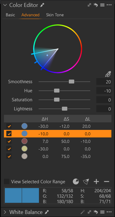
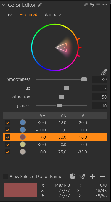
After the neutrals I handle specific colors, mainly blue, red, yellow-brownish hues:
Also pay attention on how I defined the wedges in order not to over- or undersaturate, when I change saturation:
to be continued...
0 -
Don't change the WB in this layer as this will be 'absolute' and can be counter-productive when applying to other images, at least that's what I think.
Now, the washed out look:
Now the result:
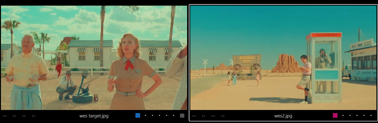
Wes' images I used as my benchmark:
Take what I did and said with a grain of salt, I am by no means a color grading expert.
Cheers,
BeO0

投稿コメントは受け付けていません。
コメント
7件のコメント