Capture One image preview color is warmer than exported color, Windows Photo app shows same warm color
This has been happening for months now and I can't seem to fix it.
I have two screens, one large for editing, one smaller for other apps, the large monitor is calibrated.
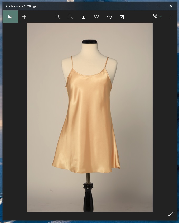
Capture one images look a lot warmer on the large monitor and a lot closer to the RAW image seen in camera on the small monitor. When exporting, the image thumbnails in the main file window look closer to the correct color on both monitors but then when I open the JPGs in the windows photo app, it shows the same warmer color.
When I move the photo app and CO from the large monitor to the small monitor, the color changes with a slight delay. The uncalibrated monitor is still closer to the RAW image. I don't understand how this could be.
CO proof profile is sRGB IEC61966-2.1 and I also export in sRGB IEC61966-2.1
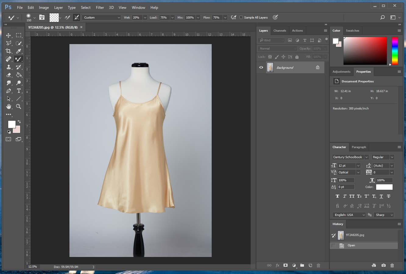
When opened in PhotoShop, it's the correct RAW color.
I hope this makes sense. I'm still new to CO, could anyone help me? Something I'm missing?
-

Sorry that’s a bit confusing. :)
Why not calibrate the second monitor as well?
0 -

Sorry, yeah it's really confusing.
So this is the difference, CO images are a lot more yellow than when I export them. The exported images are what the RAW images look like in camera (correct) I don't know why CO is making them yellow. And they are also yellow when I open them in the "photo" app on windows 10, but correct when I open them in Photoshop.
I don't use the second monitor to edit, just for emails, internet, etc.
0 -
I guess your large monitor is set to wide gamut or to AdobeRGB.
Did you check your softproofing settings in C1? In menu "View" the below two items are relevant (for the first one there is also an icon on the big toolbar.


(Note, my version is v20, so it looks a bit different as you cannot select the proof profile in v20 by the icon).
In addition, I noticed that sometime the sRGB softproofing did not work reliably in all cases (not sure if that is due to C1 or Windows as I have found mentions in the internet that Window 10 (even worse Windows 11) might have issues with color mangement, but I haven't figured out yet. Restarting C1 helps.
Or, if you want to output sRGB, calibrate and set your monitor to sRGB (that's what I do).
In any case, make sure your softproof settings are right in C1.
But maybe my analysis of your case is completely off...
0 -

The Photos application does not work with the calibration data, view the JPGs with a program like FastStone, IrfanWiew or another that works with the calibration data.
0 -
Vinh, would you have a link to a RAW we could download and play with?
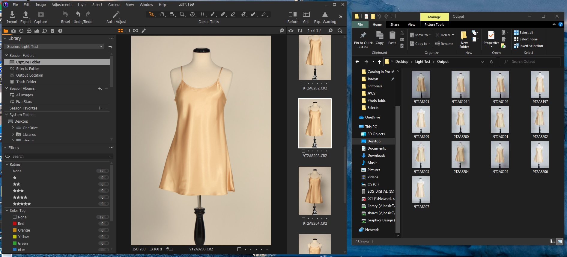
And what is that viewer program you show on the right in your first screen shot?
0 -
Permanently deleted user
And what is that viewer program you show on the right in your first screen shot?
It's not a viewer program - it's the thumbnail view in Windows Explorer, which definitely isn't colour-managed.
Vinh, it's a long-established fact that Capture One renders "warm" - some of us have been kicking against it for years - and although things have got better over the last two or three years, it's still the default "Capture One Look".
If you want colorimetric accuracy, either be prepared to put some work into creating import presets that deliver what you want; or think of looking at alternatives to Capture One.
But to reiterate the point made by Antolín, Windows "Photos" Viewer is not colour managed (at least by default), so you can't rely on it for judging colour accuracy.
0 -

Another consideration might be related to the screen technology available.
For example my notebook, purchased about a year ago, has Dell Premier Colour built in.
This provides a facility that supports multiple colour temperatures for the screen to use changed as necessary to cope with user preferences related to ambient lighting, etc. That's fine but the settings are also available per user account and per application should one wish to set them. All of which means that one has to have a complete understanding of the system set up and how the many controls and calibrations working towards colour representation are delivering their results - especially if the working environment has variable lighting conditions (i.e. is not a controlled "dark" room) as one is working.
So, viewing the comparison images provided the difference in screen captures is clear and as described. However, whether the colour impression I am seeing through the Edge browser on my screen is presenting me with the same colours others are seeing on their screen settings I have no way of knowing.
I do have the option to calibrate the screen but my calibration device is not compatible with this notebook and Windows 10. In any case since most of my output files will be viewed through an sRGB biased application of some sort the most consistent results are likely to be obtained when editing using similar settings. At the same time one hopes that the person viewing is using a device that is not itself being "colour temperature managed" by its own settings.
When printing and if seeking absolute colour matching control, a different approach may be necessary.
0 -
Despite the subtleties of color management, the images should at least look the same in PS and C1
when seen on the same screen, assuming the ICCs are there .0 -
It's not a viewer program - it's the thumbnail view in Windows Explorer
Keith, I'm not seeing that sort of viewer.
How do you get that Manage/Output option at the top?0 -
Permanently deleted user
How do you get that Manage/Output option at the top?
Right-click, untick "minimise the ribbon"
0 -
gb,
"Despite the subtleties of color management, the images should at least look the same in PS and C1
when seen on the same screen, assuming the ICCs are there ."Yes, subject to any vagaries related to jpg compression and colour presentation in the resulting output and out perception of it.
However, if somehow the Applications have been set with their own specific colour temperatures at the point of use - e.g. maybe Photoshop in this example might have a specifically cooler setting to be used for the display - then the discrepancy would persist.
I'm not saying that is the case here - but from what I can see on my system there is potential for such settings to be applied. Whether that is also true for the OP we do not know. Without knowing one way or the other it's not going to be easy to be certain of offering useful suggestions.
0 -
Got it thanks.
Second thing I learned today. :)0 -
IrfanView also can be set to be not color managed, I think it is the default.
Keith,
Windows "Photos" Viewer is not colour managed (at least by default)
I can't find a setting in Photos to enable color management. Do you know how to do it?
0 -
Vinh, you might check that your calibrated monitor ICC
is actually being used by Windows as default for that monitor.
Under Windows Display - Color profile or run colorcpl.exe.0

投稿コメントは受け付けていません。
コメント
14件のコメント