Make the "View selected color range" effect stronger
Implemented
I often have trouble seeing this effect clearly. I think it would be good if there was a mode to display the selected color in a stronger color, maybe like masks or the focus mask.
-

Hans,
The idea is to be able to see the colours not the "mask".
In many cases the colouration of an image (i.e. pixel by pixel) can be very subtle especially for some colours.
In such cases and if I feel there is a need to see things more accurately, I go to 100% view or sometimes 200% or more in order to better understand the results that appear.
Which monitor you are using may well be quite significant in influencing what you are best advised to do to see the subtle changes.
However, as a temporary visual aid when looking at the areas affected by the selection you could deploy some extreme Saturation and make all selected colours stronger whilst you assess the effect..
0 -

Hi Hans,
Thank you for your post.
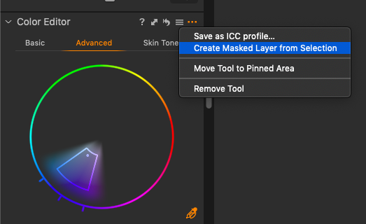
You can also make a color selection on the Advanced Color Editor, go to the Action menu, the (...) icon, and click on Create a Masked Layer from Selection.
Make sure that the Display Mask option is on (M keyboard shortcut) so that the area of an image based on the selected color range will be covered with the mask.
 0
0 -
I have done both work arounds, either cranking up saturation or creating a new masked layer. They work but it still would help me a lot if the effect was stronger so I could fine tune my color range quickly.
0 -
Hi Hans,
Thanks for the feedback, it helps to constantly improve Capture One.
I will forward your comments and suggestions to the Product Management team.
0 -
I think this links to the feeling that ALL tools in C1P are not enough visible.
0 -
To my mind there would be a downside to this suggestion. What happens at the moment is that the parts that will not be included in the colour adjustment are turned to black and white, while the parts that will be included stay coloured. I don't think it is a good idea to change the coloured parts, for instance to make them more saturated, because that would make it harder to gauge whether a colour was what you wanted it to be. Perhaps increasing the saturation of just some of the greens is what you want to do, for example. How are you to gauge that if they are displayed in some artificially enhanced green shade?
If it is thought that there is a need to see more clearly which parts are affected and which are not, a better option might be to be able to completely hide the unaffected parts, for instance turning them completely white, or completely black, instead of just black and white. (But a check box option to toggle that on and off, not a default behaviour!)
Ian
0

Post is closed for comments.
Comments
6 comments