sRGB proofing VS color managed viewer (lrfan View)

Hi everyone,
I'm having some troubles with the proofing option... I'm editing my files with a benQ sw270c hardware calibrated adobeRGB screen and i use Capture One 21 14.4.0 on Windows 10.
Here's my problem :
When my edit is done and the file (adobe RGB) is ready for a test print, i also want to export a jpeg sRGB file for my web portfolio. In the "export" tab, i select my sRGB recipe (sRVB CEI 61966 ICC profile) and then i click on the "proof" button.
There's almost no visible difference at first but if i put some color pickers, i can see that colors does change so slightly that it's almost nothing (but if i do the same proofing in lightroom or photoshop, the difference will be clearly noticeable).
Then I export my file and i take a second look at it with lrfanView (which is color managed) and here are the troubles. I can see that the sRGB file is more punchy and saturated than the adobe RGB file.
So, the sRGB proofed view in Capture One is totally different from the same file but viewed with lrfan View or from the proofing process of lightroom / photoshop
Am i doing something wrong ? Or is there a problem with my Capture One ?
-

Hi,
I don't have an explanation or solution, just some thoughts that might help to understand what's going on.
Regarding proofing in Capture One: You should only see a difference on screen if your image contains colors, that are not possible in sRGB. Those colors then would look more muted as soon as you enable sRGB proofing. If your image doesn't and it looks almost the same with and without proofing, then that is a good sign, that color management is doing its job perfectly. What is selected in menu "View"->"Proof profile"? That selects the profile which is used if profiling is disabled. I usually have it at "no proof profile". No idea, what is the idea behind that. Instead of comparing the readouts when you enable and disable proofing, you might want to leave proofing enabled and toggle between sRGB and adobeRGB receipt. There you should see quite a difference in the readouts.
IrfanView: I would not rely on it for color evaluation. Its color management is a very poor implementation that only works in certain constallations, I don't remember exactly anymore. Problem is, that color management was appended to an already existing application, but usually you have to design with it throughout the whole image processing engine. That is the reason why I switched from IrfanView to XNview MP some time ago, which handles profiles far better. If the sRGB version is more punchy in ifanview, that sounds like it ignores the color profile embedded in the image.
I hope, that gives you some ideas where to look at.
Alex
0 -

I cannot confirm what the PO is seeing in PS and LR.
Setting proofing to sRGB for a Sony RAW in both of those results in the same almost imperceptible change I see in C1.
The InfranView image is brighter with more contrast.0 -

Hello,
I am also seeing this problem. I have a monitor that is sRGB and Adobe switchable. When i process an Adobe Image then turn sRGB proofing on the wave form adjusts but I can see no change to the image. When I export as Adobe or sRGB, both results are the same. As in when I open them in another software, PS, Windows Viewer Google Drive, my phone, there is no difference, they both look Adobe like. It is like Capture One is not converting to sRGB in the viewer or on export. psd or jpeg.
However when I export the adobe file to PS, then go Export, covert to sRGB the difference is clear as day. Whn in Adobe mose on the monitor the sRGB export preview looks terrible, switch monitor to sRGB and hey presto its perfect, and the adobe washed out as you would expect. SO, it appears that Capture one is NOT showing the conversion or applying it on export. HELP.
0 -
Same or similar problem here. Eizo Monitor, hw-calibrated with Eizo software Color Navigator. When I soft-proof sRGB with C1 it doesn't look like sRGB, so I always switch the monitor via Color Navigator to sRGB in addition to the soft-proof in C1. This seems to show the image in C1 viewer correctly with sRGB colors. I did not know that others are having also such an issue.
This is btw not the only thing C1 should improve in the realm of softproofing, which I request since years...
0 -
Proofing from say ProPhotoRGB to sRGB in C1 certainly does something though.
I'm looking at a slightly tele shot of the sun close to the horizon.
ProPhotoRGB shows a smooth transition of color right up to the sun disk.
sRGB puts a large yellow/orange, slightly low contrast, halo around the sun.
Also color readouts on any image will change, often significantly, as you switch profiles.
?0 -
Yes. It also does something when softproofing with a printer profile, it does something when switching between adobeRGB and sRGB too, depending on the saturation of the image, but the colors in sRGB look more like sRGB when switching the monitor from Adobe (or full monitor) gamut to sRGB. The problem of course is that this is not a real evidence for my perceived issue, since the sRGB calibration of the monitor could be wrong. Or the "wrong" rendering intent is set in C1 preferences, or black point compensation (which cannot be controlled in C1 (C1, do you listen?)).
I don't remember all the tests I have done with external applications, I once figured out and settled with the trick to set the monitor to sRGB which I believe gives me the best approximation to sRGB I can get. Also, there is nothing like THE sRGB on the "market", there seems to be debates which the correct sRGB is. And given that I can produce satisfying sRGB prints (some photobook software requires sRGB, not adobeRGB), and given that every monitor/browser in the internet shows colors slightly different, I stopped bothering further. For now at least.
0 -
That is interesting. I'm more than happy with CaptureOne's color management. It is even smart enough to detect when I change the profile of the monitor during runtime and immediately adjusts to the new monitor profile. I can't say that about my (admittetly quite old) photoshop. There, I have to quit and restart to have correct colors again.
For proofing, CaptureOne is missing two of adobe's features. I'm not sure, if black point compensation and simulate paper white are proprietary to adobe. I think I read that somewhere but I'm far from sure about that.
BeO, can you explain "... the colors in sRGB look more like sRGB when switching the monitor from Adobe (or full monitor) gamut to sRGB" ? I would read from this, that you load an image in C1, enable receipt proofing and select some receipt that uses sRGB. Then in Eizo color navigator, you switch between adobeRGB and sRGB profile and watch the image in C1. Do you see any difference?
I think if everything is setup correctly, visually, all colors should look exactly the same no matter which monitor profile you use as long as it encompasses sRGB. Even if you use a receipt with a larger color space, only colors that can not be represented in sRGB should loose saturation when the monitor profile is set to sRGB. At least that is how it works for me.
As you say, it seems like a lot of companies have published slightly different flavours of sRGB. I think, if you look for THE standard, that would be sRGB-IEC61966-2.1.
0 -
Hi Alexander,
Glad to hear that is works for you. For you as well as for me, because that could mean that I have possibly done something wrong and can figure out what. Let me answer first, and I will back this up with a sample and screenshots.
It is even smart enough to detect when I change the profile of the monitor during runtime and immediately adjusts to the new monitor profile.
How do you notice that C1 adjusts? If I switch the profile in ColorNavigator (CN) I see the colors of every item incl. Windows icons and windows change, but I don't see that C1 adjusts.
I can't say that about my (admittetly quite old) photoshop. There, I have to quit and restart to have correct colors again.
For proofing, CaptureOne is missing two of adobe's features. I'm not sure, if black point compensation and simulate paper white are proprietary to adobe. I think I read that somewhere but I'm far from sure about that.
Affinity Photo (and Gimp, if I recall right) has these options.
BeO, can you explain "... the colors in sRGB look more like sRGB when switching the monitor from Adobe (or full monitor) gamut to sRGB" ? I would read from this, that you load an image in C1, enable receipt proofing and select some receipt that uses sRGB. Then in Eizo color navigator, you switch between adobeRGB and sRGB profile and watch the image in C1. Do you see any difference?
Yes, a massive difference. I only see differences when switching between monitor profiles, or when swiching in C1 between sRGB and a printer profile or adobeRGB and a printer profile.
I think if everything is setup correctly, visually, all colors should look exactly the same no matter which monitor profile you use as long as it encompasses sRGB.
That is my expectation too. My reality here is different.
Even if you use a receipt with a larger color space, only colors that can not be represented in sRGB should loose saturation when the monitor profile is set to sRGB. At least that is how it works for me.
Probably right.
As you say, it seems like a lot of companies have published slightly different flavours of sRGB. I think, if you look for THE standard, that would be sRGB-IEC61966-2.1.
This is maybe a whole different topic to discuss.
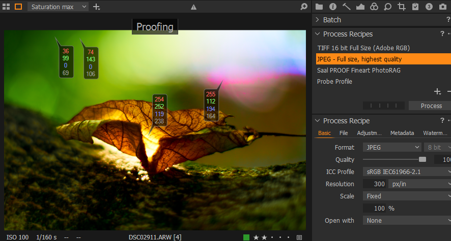
Example:
I have a very colorful image, and maxed out the saturation two times (200).
My ICC profiles are AdobeRGB, sRGB, a printer profile, and a "probe" profile from the internet which falsifies colors.
1. Monitor set to AdobeRGB
- AdobeRGB:
I see a very colorful image (green, orange, clipped pinks).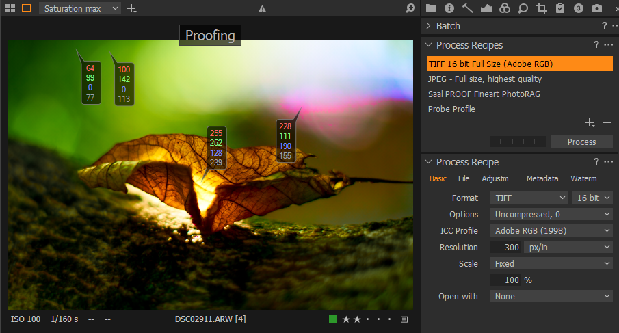
- sRGB:
No visual change at all, but some values changed.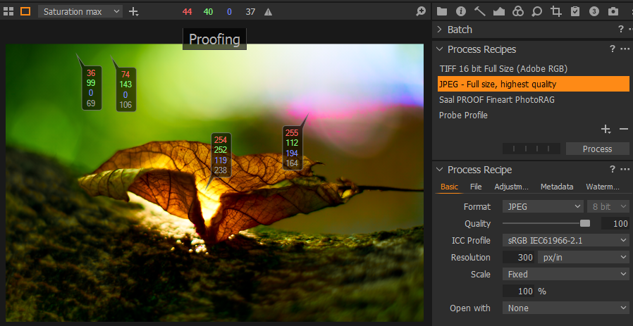
to be continued...
0 -
- Printer profile:
The image lost a lot of contrast, values change, soft-proofing works.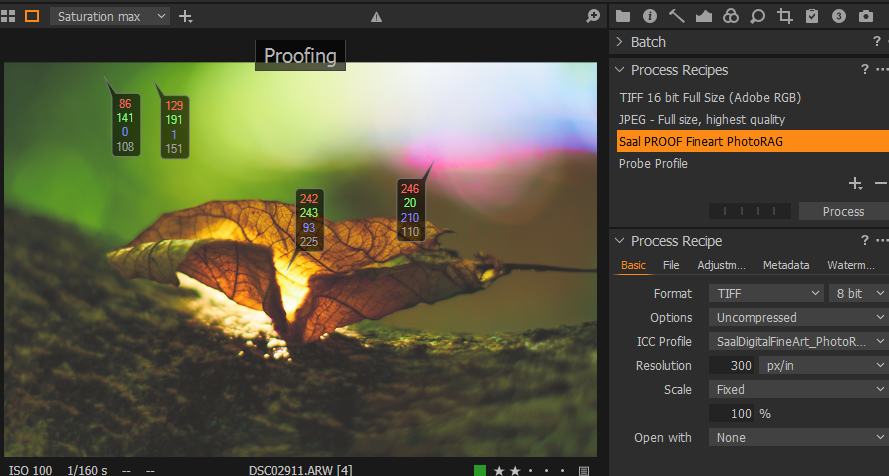
- Probe profile (possibly CYMK, I just don't remember):
Falsified colors, soft-proofing works.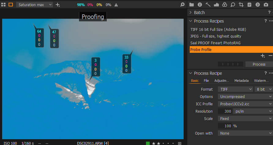 0
0 -
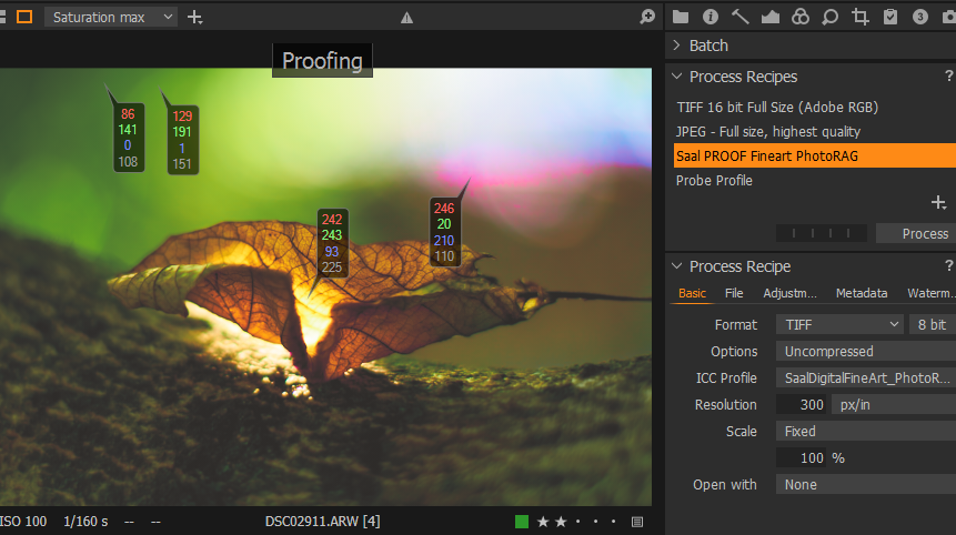
Now I switch back to proof profile sRGB and switch monitor via CN.
2. Monitor set to sRGB
- sRGB
I immediately see a huge loss in saturation when switching monitor with CN to sRGB
- switch to AdobeRGB
no visual change at all, only values: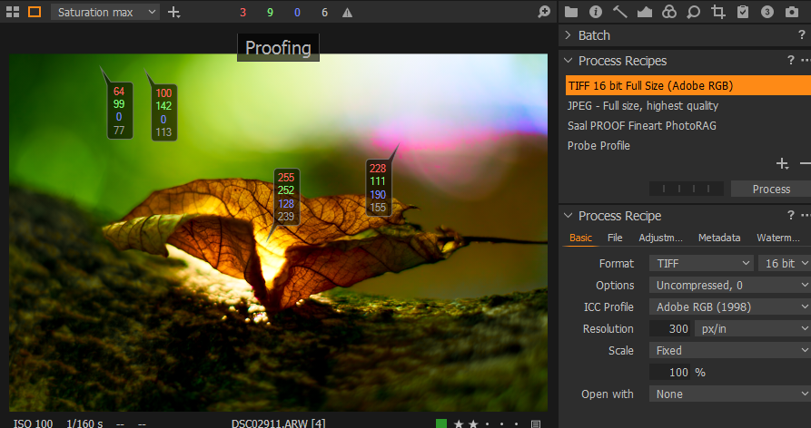
- Printer profile, again loss of contrast:
 0
0 -
- Probe profile, to complete the series:

Here my calibrated and self-defined monitor profiles used, I don't think they are responsible because switching monitor profiles shows a massive visual difference, whereas swichting icc profiles in C1 sRGB vs. AdobeRGB does not. (last calibration date is a bit long but the monitor does not drift much)
 0
0 -
How do you notice that C1 adjusts? If I switch the profile in ColorNavigator (CN) I see the colors of every item incl. Windows icons and windows change, but I don't see that C1 adjusts.
When I change the monitor profile e.g. from sRGB to full monitor, everything including the loaded image in C1 massively increases in saturation. After maybe 1 second, the images returns to the same appearance it had when the monitor was set to sRGB. So C1 has realized the changed monitor colors and corrected its output accordingly.
Color Navigator at the same time tells the monitor which profile it should use as well as switching the ICC file that is linked to the monitor in windows. The ICC file describes exactly, how the monitor renders RGB values. All things that are not color managed like icons in windows (or anything in windows) will change appearance when you change the monitor profile. That is because windows doesn't take care of the ICC and still sends the same RGB values to the monitor which now yield a different color. But C1 (or any color managed program) takes notice of the change and adjusts the RGB values with help of the ICC file, so that the colors emitted by the monitor are stll exactly the same. The ICC file tells C1 exactly how the monitor displays RGB values. So it can use that information to always display colors from an image in the same way, no matter how the monitor is set.
I'm still not 100% sure, if I can grasp what you see. Those statements:
If I switch the profile in ColorNavigator (CN) I see the colors of every item incl. Windows icons and windows change, but I don't see that C1 adjusts.
and
Yes, a massive difference. I only see differences when switching between monitor profiles
seem contradicting to me, but I possibly just don't get it X-)
0 -
What I mean is
e.g. proof profile set to sRGB, monitor in sRGB.
When I change the monitor profile from sRGB to Adobe, everything including the loaded image in C1 massively increases in saturation. After maybe 1 second, nothing happens, it still is massively saturated.
C1 does not adjust. Maybe a wrong setting in Windows color managent? I had this with Win7 as well as now with Win10 (though it was an inplace upgrade, which might have kept the problem).
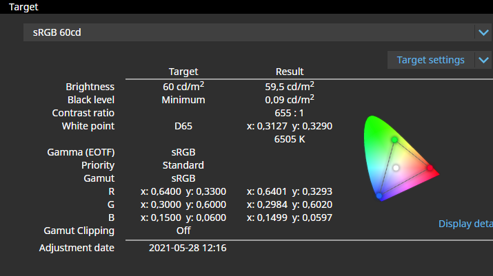
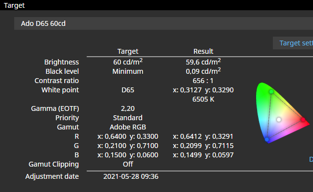
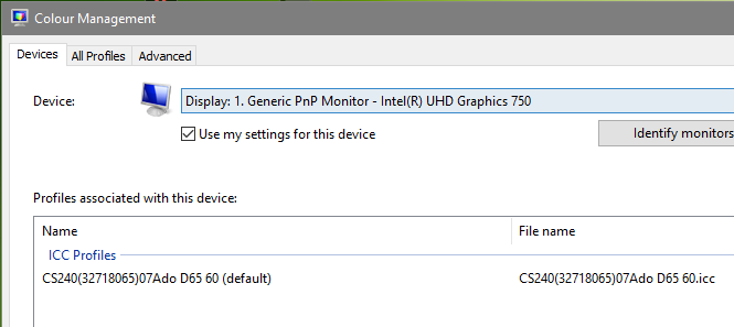
When I set the profile "Ado D65 60" in CN, this is what I see in Windows color management:
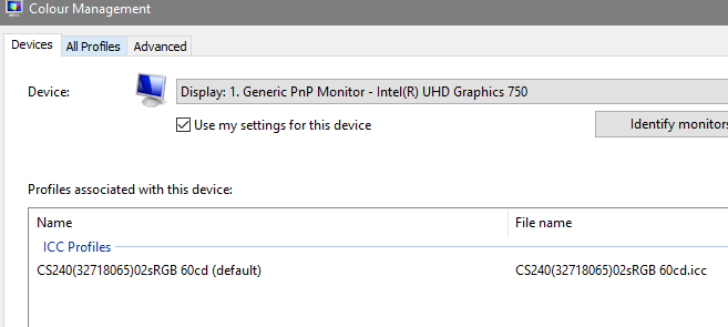
When I set "sRGB 60cd" in CN, this is what I see:
 0
0 -
0
-
0
-
I restartet C1. Before, I had a session and a catalog open at the same time. After restart I can see the C1 adjusts the colors after 1 second.
With the recipe sRGB, when I switch the monitor from sRGB to Adobe, the image is highly oversaturated for 1 second (probably the RGB values are interpreted as Adobe or wide gamut) before the the adjustment kicks in and shows the image normally saturated, likely in sRGB.
Same when the recipe is AdobeRGB. when I switch the monitor from sRGB to Adobe, the image is highly oversaturated for 1 second before the the adjustment kicks in and shows the image likely in Adobe.
This is a problem if you want to compare sRGB with AdobeRGB and do this via monitor (CN) switch, you can't, as this 1 second oversaturation kills your memory. So, you need to switch using C1 recipes and leave the monitor set in Adobe (or wide gamut).
Summary:
It seems C1 recipe proofing works, sometimes.
So, not quite as bad as I have described. I don't think the unreliability is solely due to more than 1 catalog open, but even 10 catalogs or sessions open should not bring C1 out of the "reliability space"...Many thanks Alexander for your time and effort! Really appreciated!
BeO1 -
You are very welcome, great that it works :-) I will try multiple catalogs / sessions when I find the time. Maybe you found a bug? Your feature request has another vote ;-)
0 -
Thank you Alexander :-)
If it would be easily reproducible on more than one users' machines, it would have a chance to be recognized as a bug when reported to C1, though it is hard to explain, show or screenshot, unfortunately.
Because the recipe proofing is not working reliably on my computer and hard to detect when it is and when it isn't, I established quite a while ago to the habit to switch my monitor to AdobeRGB or sRGB, depending on what my output format would be, in addition to setting the correct proofing recipe.
Of course, the ideal situation would be to keep the monitor in its widest gamut and switch the profiles as needed in the C1 recipies tool.
However, I have another consideration why I switch my monitor to the respective file color space (AdobeRGB or sRGB and not wide gamut).
That is when I prepare an image file to export during softproofing, with the goal to send the file to my commercial printing service, e.g. a TIF AdobeRGB file.
According to this article from C1https://support.captureone.com/hc/en-us/articles/360002861957-Capture-One-color-gamut
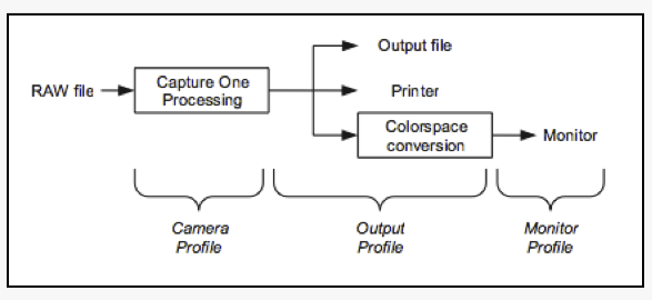
, what happens if you are soft-proofing is the following conversions (if I understand correctly):Softproofing:
Camera profile -> profile printer/paper (abc) -> monitor (wide gamut)But when you send this TIF file to a commercial printing service, this is what happens
Reality:
Camera profile -> TIF file (AdobeRGB) -> printer/paperIn the first sequence of conversions above (softproofing), there is no AdobeRGB at all.
Given that color conversions must deal with out of gamut colors, and they do this according predefined rules (depending on rendering intent), I have some doubts that this will correctly simulate what happens later when I send a TIF file.
When I create the AdobeRGB TIF file, printer colors not in AdobeRGB will be converted to the color space of AdobeRGB and are thus removed forever, even if the camera, printer and the monitor could handle these colors. You can replace AdobeRGB above with sRGB (e.g. when you send a JPG), but still C1 would do the same soft-proofing.
But when I switch the monitor profile to AdobeRGB instead of wide gamut, then at least there is AdobeRGB somewhere in the sequence:
Camera profile -> profile printer/paper (abc) -> AdobeRGB (monitor)I am not sure though if that really helps to be more precise because the diagram explains that the monitor profile conversion is the last step.
I think it would be ideal if the sequence would look like
Camera profile -> AdobeRGB (TIF file) -> profile paper abc -> monitor (wide gamut)
because this would actually simulate what will hapen later, i.e.
1. Export image to TIF: Camera profile -> AdobeRGB (TIF file)
2. Send file (TIF AdobeRGB) to printing service
3. Print AdobeRGB (TIF file) on printer/paper
To say it in different words:Currently, when softproofing, C1 does not know whether I will send a JPG file in sRGB or a TIF file in AdobeRGB, so how can C1 "simulate" the final print?
But that's what a soft-proof function is supposed to do. This process has the file which is being sent to the service as a bottleneck:
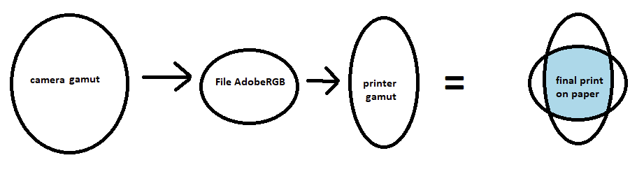
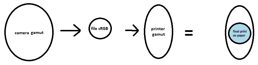
Hence I think: C1 softproofing should allow to set TWO profiles, the printer profile and the profile of the file being sent to the printing service.
- allowing to keep the monitor in wide gamut- preventing users from accidentially exporting to a file with the printer/paper profile
- more correctly simulating the bottleneck of the file's color space, in case of out of gamut colors
0 -
Very good thoughts, I agree in all points.
Ideally, the receipt profile would dictate the colorspace for the file export and you could select an additional output profile that simulates what happens from file to print.
I think to find clipped colours, the highlight warning is essential. But wouldn't it be possible, to just check twice: once with a adobeRGB profile and once with the printers profile. If both have no clipped colours, you should be save.
Another approach might be to check first, if the printer gamut contains any colours outside adobeRGB. If not, just proofing with the printers profile should be sufficient.0 -
Ideally, the receipt profile would dictate the colorspace for the file export and you could select an additional output profile that simulates what happens from file to print.
Yes!
Including settings for rendering intent, BCP and simulate white paper.
I think to find clipped colours, the highlight warning is essential.
I am not sure that highlight (and shadow) warning actually work as out-of-gamut warning (that's what you mean with "clipped", right). The most saturated yellow is the brightest yellow (highlight warning?). Most saturated blue is the darkest blue (Shadow warning?). What about green and pink?
But wouldn't it be possible, to just check twice: once with a adobeRGB profile and once with the printers profile. If both have no clipped colours, you should be save.
Hm, maybe.
But being save (regarding out of gamut colors) is one thing, for some images, but for others you might also want to see (as good as your monitor can) how the result would look like if the out of gamut colors are converted, and, how the in-gamut colors are converted (depending on the rendering intent, e.g. "perceptual"). And want to adjust your image accordingly / to your liking.
Another approach might be to check first, if the printer gamut contains any colours outside adobeRGB.
I don't know how you would do this, and this is very likely to be the case anyway (most printers have colors outside the monitor colors). But if your printing service accepts sRGB and AdobeRGB and nothing else, then AdobeRGB will be the bottleneck regardless of the printer gamut anyway.
But I am not certain, this whole topic actually is a topic which I as a "normal" user desire professional expertise - baked into professional software features.
PS (or Affinity Photo) are different, you have a file after the raw conversion process, and this file has a RGB color space assigned (AdobeRGB, isn't it?), so PS knows for any soft-proofing which color space to convert to the printer profile. That is not the case with C1 (unless the "two-profiles" recipes would be implemented). How is this solved in LR I don't know.
Cheers
BeO0 -
I am not sure that highlight (and shadow) warning actually work as out-of-gamut warning (that's what you mean with "clipped", right). The most saturated yellow is the brightest yellow (highlight warning?). Most saturated blue is the darkest blue (Shadow warning?). What about green and pink?
I'm quite sure. When you load an image with very saturated colours and enable warnings and proofing, you will see different warning areas depending on the receipt profile. You can also double check using colour pickers. Colour pickers will show the RGB numbers with respect to the currently active profile. if you have proofing enabled, they will show numbers in the currently active receipt. If it is disabled, it will show values from the profile selected in menu view->proof profile. If that profile is "no proof profile", it will show RGB values according to the camera profile. Next step: If you enable exposure warnings, all the colors will be marked, where at least one channel is at or above the highlight warning level selected in preferences (or at / below the shadow warning level). You will see that RGB numbers change when you switch receipts with sRGB and adobeRGB. All areas where the sRGB profile shifts values too close to 255 / 0 will be marked while they are unmarked in adobeRGB if colour values are far enough from 255 / 0. Of course usefulness as gamut warning depends on the thresholds that are set in preferences.
But being save (regarding out of gamut colors) is one thing, for some images, but for others you might also want to see (as good as your monitor can) how the result would look like if the out of gamut colors are converted, and, how the in-gamut colors are converted (depending on the rendering intent, e.g. "perceptual"). And want to adjust your image accordingly / to your liking.
I'm not sure, if a softproof can accomplish that, especially rendering of out of gamut colours. Here I can't even provide half knowledge :-P But maybe that is well possible. As far as I know, profiles usually contain a different translation table for each rendering intent, they support. So it depends on the profile, which intents are usefully possible.
Another approach might be to check first, if the printer gamut contains any colours outside adobeRGB.
I don't know how you would do this, and this is very likely to be the case anyway (most printers have colors outside the monitor colors). But if your printing service accepts sRGB and AdobeRGB and nothing else, then AdobeRGB will be the bottleneck regardless of the printer gamut anyway.
I wouldn't be so sure about typical printer gamuts. If you have an sRGB screen, you are absolutely right. But I think, even with a top printer, typically there are only a few areas where the printer gamut is slightly outside adobeRGB. If you have a good Eizo or NEC monitor, that again has a much larger gamut than adobeRGB, then I'm quite sure that you will have a hard time to find a printer with a gamut not inside the monitor gamut.
Comparing gamuts is indeed difficult. I tried to find such a tool some time ago. There is one online tool at https://www.iccview.de/ which works nicely. Unfortunately, it only supports v2 profiles, while most output profiles available seem to be v4. Apart from that, there seem to be only commercial tools available. I could imagine, that ArgylCMS would be able to do it too, but I have no idea, how to massage it. Over at luminous-landscapes.com a few members are true colour geeks. I think, also the author of ArgylCMS. I will ask if and how that would be possible.
PS (or Affinity Photo) are different, you have a file after the raw conversion process, and this file has a RGB color space assigned (AdobeRGB, isn't it?), so PS knows for any soft-proofing which color space to convert to the printer profile. That is not the case with C1 (unless the "two-profiles" recipes would be implemented). How is this solved in LR I don't know.
I think internally, PS uses CIE Lab as working colour space unless you specify something else. At least it uses it for all calculations. Cie Lab contains all visible colours so there are no colours that can't be encoded. But I have never used PS to develop raw files, so I have no idea which colour space it will use.
It's possible that this whole discussion is a bit academic :-P Maybe adobeRGB is just large enough that all those limitiations have just a marginal effect. To be honest, I have read a lot of stuff about colours and colour management out of curiosity but I have little experience with actual printing :-P That would definetly help to judge practical relevance ;-)
0 -
Interesting. Also the iccview page. Thanks.
It's possible that this whole discussion is a bit academic
Possible. I not even have a reliable softproof with current C1 as it sometimes does not work without any notice, and my commercial printing service explicitely discourages anyone to soft-proof with C1 (contrary to PS and LR), so this should have a higher priority for me than inventing possibly cool new features...
0 -

I have read all the comments moved by the fact that my photos exported to JPG selecting SRGB do not have any resemblance to what I see in C1 and that activating or not the test mode does not imply any change in what I see or in what results of export.
I have a recently calibrated Eizo screen, to see the JPGs I use FastStone and my JPGs are always more saturated and with more vivid colors than the C1 viewer
I am sure that my poor knowledge of the subject is the cause of these frustrating results and I wonder:
- How difficult would it be for the result to depend solely on the choice of the output color space?
- I have been reading about color for years and today I have not been able to follow your reasoning, the terminology is especially complicated for a basic user like me.
What can I do to make my JPGs look like what I see on the C1 screen?
0 -
Hi Antolin,
- In C1, make sure the JPG export recipe has the sRGB ICC profile
- In C1, "Enable recipe proofing" (in the View menu or the big button with the glasses)
- In C1, select the JPG export recipe
- In FastStone, enable settings>CMS>color management (If it is not enabled probably sRGB would be used as the default, but who knows...) (I don't use FastStone but you can search for "FastStone color management" to get more details)
The image in the C1 viewer and the JPG file in FastStone should look very similar, or even identical.
0 -
Hey BeO,
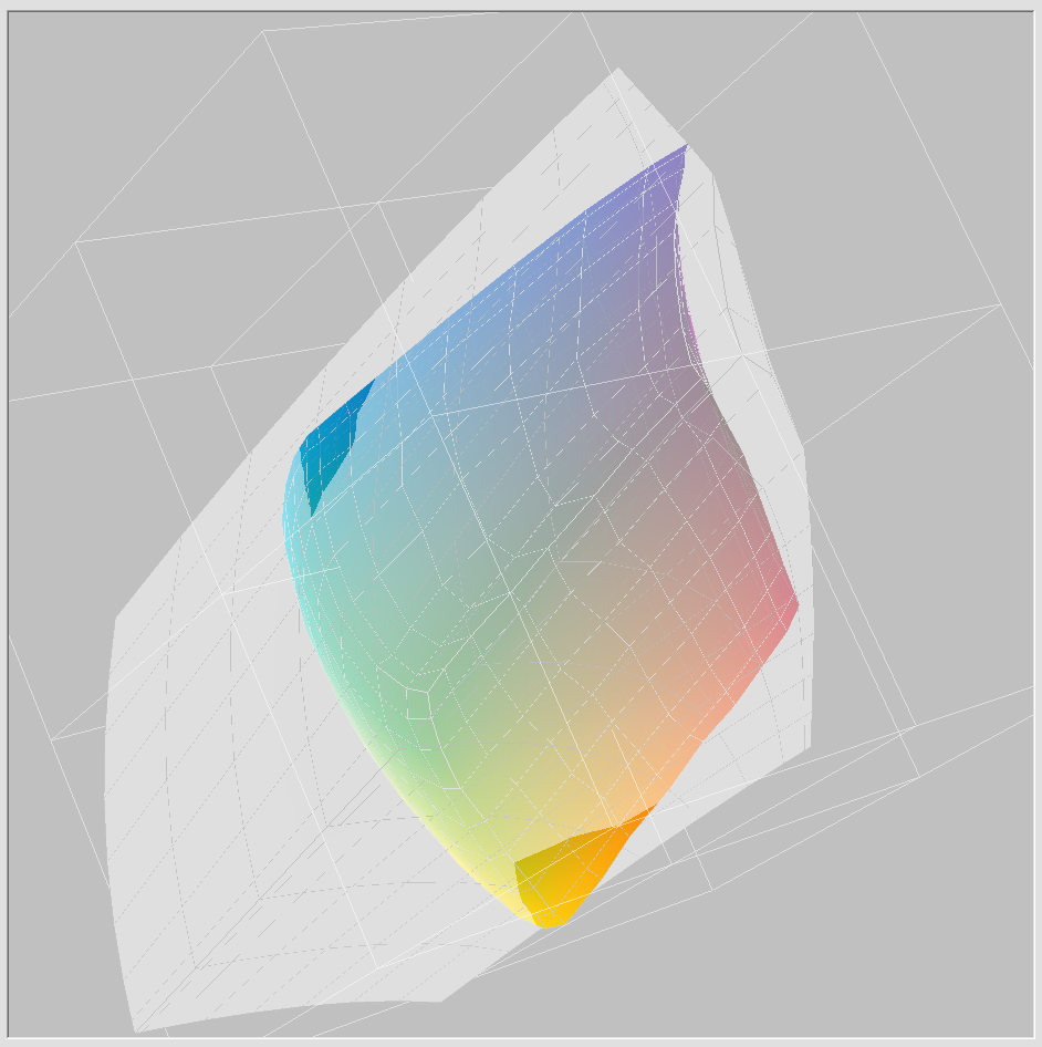
I got a great hint for a tool to compare gamuts (see https://forum.luminous-landscape.com/index.php?topic=139485.0)
The tool is called CoPra (https://colorlogic.de/en/copra/ ), a profiling software that has a limited subset of functions also without a licence. Visualising gamuts, and also showing actual colours of an image within that gamut is one of those functions and works great.
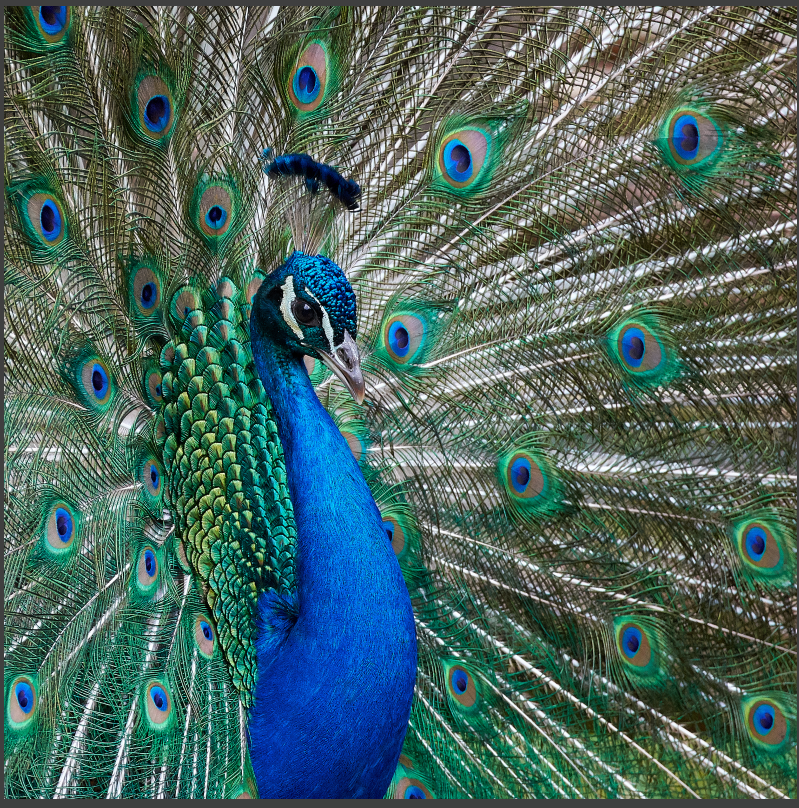
here is an image with very saturated colours:
And this is the representation of that file within a random fineart print gamut (using relative colorimetric intent).
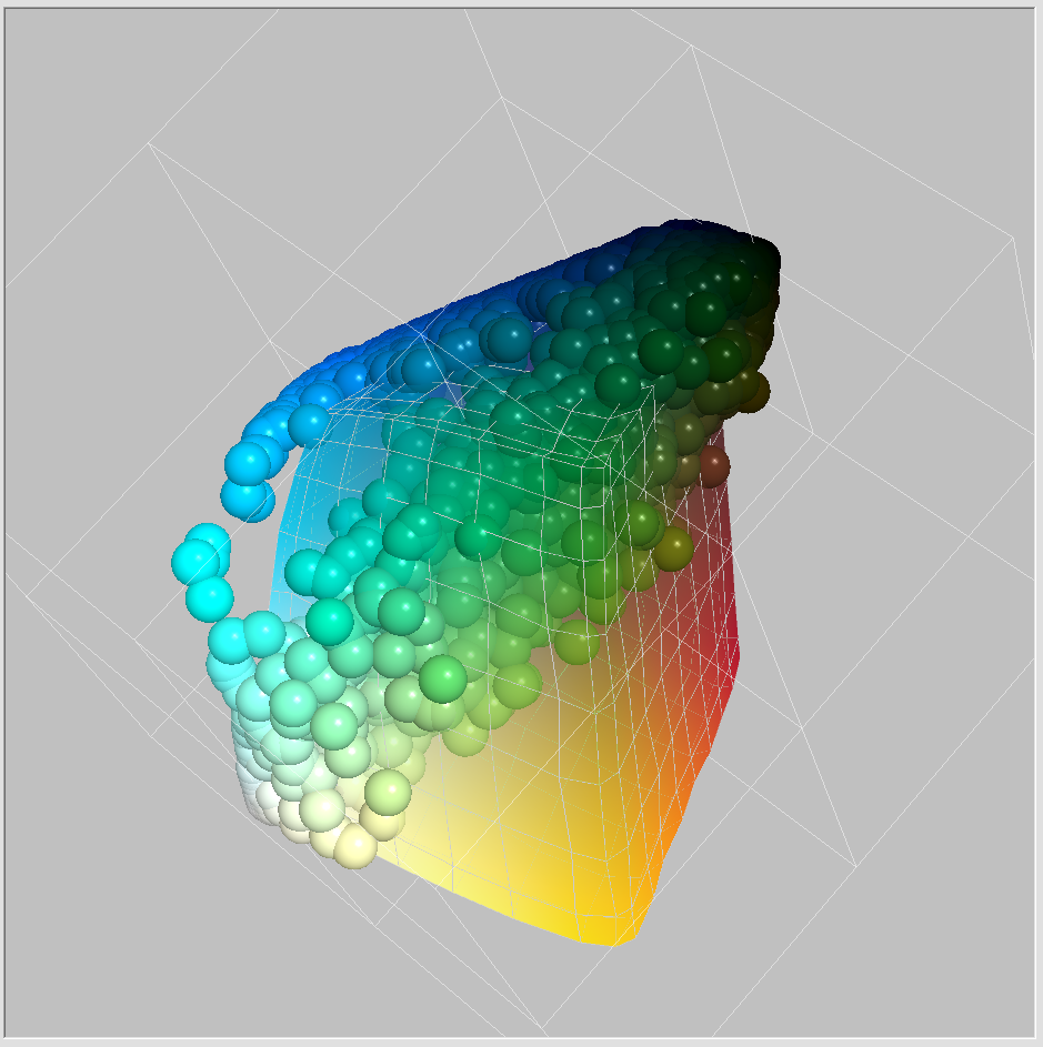
Now the same gamut compared to adobeRGB
 0
0 -
Antolín Agar wrote:
"I have a recently calibrated Eizo screen, to see the JPGs I use FastStone and my JPGs are always more saturated and with more vivid colors than the C1 viewer"I just downloaded and installed FastStone and indeed
the jpegs first up are way more saturated than C1.
However I went into FastStone Settings, and under CMS,
I found that although "Use color management" was checked there,
the "Auto detect and use monitor color profile" box was not checked.
After checking that box and OKing out, FastStone colors are now very similar to C1.0 -
Thanks friends BeO and gb.
Perfect.
I have followed your instructions and now I see the same colors in FasrStone and C1.
After checking the option "Auto detect and use the monitor profile", the match is complete.
Thank you, thank you, thank you.
1 -
Antolín, this award goes to.... gb
:-) as he has even downloaded FastStone. Glad it works for you now.
0 -
Alexander,
Thank you. I like this kind of stuff... I will look into it.
In iccview.de I also could upload an image, similar functionality. Don't quite understand yet the hint about the relative colorimetric intent, because rendering intent matters only during conversion, in which case the image colors should be inside the printer gamut.
It looks that AdodeRGB almost fully covers the printer gamut, not quite, and inks / paper are getting better (at least they could) whilst AdodeRGB is fixed.
0

Post is closed for comments.
Comments
29 comments